 Vize
Input
Accessible, unstyled native text input with controlled and uncontrolled state.
| Package | @vizejs/ui/input |
| Maturity | stable |
| Own the source | vize lib pull input |
| Requires | controllable-state, id |
| Aliases | text input, field input, textbox |
| Covers | HTML input, React Aria TextField, Reka UI Primitive |
Minimal setup
Use a Vue 3.5+ project with Vue SFC compilation configured (see Vite+ integration).
vp install @vizejs/ui
Add the public import below to <script setup lang="ts">. Components provide behavior without styles; the preview uses optional Paper styles.
import { Input } from "@vizejs/ui/input";
Or copy the source into your project with vize lib pull input (see Source Distribution).
Try it
This is the basic example maintained with the component source, using the public package imports. The preview adds the optional Paper styles.
Open the interactive example · Styling these components
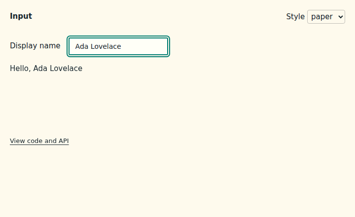
Copy the example
<!-- Controlled text input bound with v-model and labelled by a native label. -->
<script setup lang="ts">
import { ref, useId } from "vue";

import { Input } from "@vizejs/ui/input";

const name = ref("");
const inputId = useId();
</script>

<template>
  <div>
    <label :for="inputId">Display name</label>
    <Input
      :id="inputId"
      v-model="name"
      name="displayName"
      autocomplete="nickname"
      placeholder="Ada Lovelace"
    />
    <output :for="inputId">Hello, {{ name || "stranger" }}</output>
  </div>
</template>
API
Input
Source: src/families/form/input/text-input.vue
Props
| Prop | Type | Default | Description |
|---|---|---|---|
id |
string | null |
undefined |
Consumer-owned control id. null and undefined select a deterministic fallback. |
name |
string |
undefined |
Native form field name. |
type |
InputType |
"text" |
Text-like native input type. |
modelValue |
string |
undefined |
Controlled string value. undefined selects uncontrolled behavior. |
defaultValue |
string |
"" |
Initial value for uncontrolled use and the value restored by form reset. |
disabled |
boolean |
false |
Disable editing, focus, and native form submission. |
readOnly |
boolean |
false |
Keep the input focusable while preventing user editing. |
required |
boolean |
false |
Mark the input as required for native constraint validation. |
placeholder |
string |
undefined |
Native placeholder text. |
autocomplete |
string |
undefined |
Native autocomplete hint. |
inputMode |
InputInputMode |
undefined |
Native virtual-keyboard input mode. |
enterKeyHint |
InputEnterKeyHint |
undefined |
Native virtual-keyboard enter key hint. |
ariaLabel |
string |
undefined |
Accessible name when no label or aria-labelledby supplies one. |
ariaLabelledby |
string |
undefined |
Space-separated ids that label the input. |
ariaDescribedby |
string |
undefined |
Space-separated ids that describe the input. |
ariaErrormessage |
string |
undefined |
Id of the validation error message used while invalid. |
ariaInvalid |
InputAriaInvalid |
false |
Invalid state announced to assistive technology. |
Events
| Event | Payload | Description |
|---|---|---|
update:modelValue |
[value: string] |
Fired when the value requests a new controlled string. |
input |
[value: string, nativeEvent: Event] |
Fired after a native input event with the next string and native Event. |
change |
[value: string, nativeEvent: Event] |
Fired after native change/commit with the current string and native Event. |
compositionStart |
[value: string, nativeEvent: CompositionEvent] |
Fired when IME composition starts. |
compositionEnd |
[value: string, nativeEvent: CompositionEvent] |
Fired when IME composition ends. |
Exposed
| Member | Type | Description |
|---|---|---|
composing |
boolean |
Whether the native input is currently inside IME composition. |
value |
string |
Current controlled or uncontrolled string value. |
focus |
(options?: FocusOptions) => void |
Move focus to the native input. |
select |
() => void |
Select the current native input text. |
setValue |
(value: string) => boolean |
Request a value update and report whether it differs. |
reset |
() => boolean |
Restore the current default value and report whether it changed. |
element |
Readonly<ShallowRef<HTMLElement | null>> |
Template ref to the rendered root element. |
Behavior
Normative state × input → outcome table for text-input.vue (@vizejs/ui/input).
Every row is proven by the named mounted-DOM test in
src/families/form/input/input.test.ts; a row
without a passing test is a contract violation.
| # | State | Input | Outcome | Proven by |
|---|---|---|---|---|
| I1 | editable, native | render | native text-like <input>, deterministic id, accessible name, form attributes, data-vize-ui="input", and invalid ARIA state |
renders a named native input with form and accessibility attributes |
| I2 | uncontrolled | native input / change | value follows the native element; emits update:modelValue before input, and emits change with the committed string |
uncontrolled input emits model before input and reports native change |
| I3 | controlled | native input | emits the request; the rendered value reverts to modelValue until the parent accepts the update |
controlled value wins until the parent accepts the request |
| I4 | uncontrolled, seeded | form reset | defaultValue seeds the initial value and form reset restores it without request-global state |
defaultValue seeds state and native form reset restores it |
| I5 | disabled | render / Tab | native disabled, data-state="disabled", no sequential focus |
disabled and read-only inputs keep native availability semantics |
| I6 | read-only | render / Tab | native readonly, data-state="readonly", remains focusable |
disabled and read-only inputs keep native availability semantics |
| I7 | composing | IME composition | data-composing and exposed composing track composition start/end while preserving the composed string |
tracks IME composition without losing the composed value |
| I8 | uncontrolled | exposed methods | setValue() updates uncontrolled state, select() selects text, focus() focuses the input, and reset() restores default |
exposes value mutation, selection, focus, and reset controls |
The subpath remains tree-shakable and retains no packaged CSS; those package
contracts are pinned by distribution.test.ts, check:size, and
check:tree-shaking.