 Vize
Vize
Musea
⚠️ Work in Progress: Musea is still evolving. File formats, APIs, and UI behavior may change.
Musea is Vize's art-file and component-gallery toolchain.
vize_museais the Rust core for parsing*.art.vue, generating docs, building prop palettes, autogenerating variants, and preparing VRT data.@vizejs/vite-plugin-museais the recommended gallery and dev-server workflow today.musea-vrtis the CLI for visual regression snapshots, a11y audits, approvals, cleanup, and generated art files.
Overview
Musea uses *.art.vue files to describe component variants with Vue-native syntax.
Installation
Install vp once from the Vite+ install guide, then add the package:
vp install -D @vizejs/vite-plugin @vizejs/vite-plugin-musea vize
Recommended Usage: Vite Plugin
// vite.config.ts
import { defineConfig } from "vite";
import vize from "@vizejs/vite-plugin";
import { musea } from "@vizejs/vite-plugin-musea";

export default defineConfig({
  plugins: [
    vize(),
    musea({
      include: ["**/*.art.vue"],
      basePath: "/__musea__",
      previewCss: ["src/styles/main.css"],
      previewSetup: "musea.preview.ts",
    }),
  ],
});
Run your normal Vite dev server and open the configured Musea route:
vp dev
http://localhost:5173/__musea__
If you install the vize npm package, vp exec vize musea is a convenience wrapper around Vite:
vp exec vize musea
vp exec vize musea --build
Shared Config
musea() options override shared config. Put stable project defaults in vize.config.ts and keep
preview-only settings in vite.config.ts.
// vize.config.ts
import { defineConfig } from "vize";

export default defineConfig({
  musea: {
    include: ["src/**/*.art.vue"],
    exclude: ["node_modules/**", "dist/**"],
    basePath: "/__musea__",
    storybookCompat: false,
    inlineArt: false,
  },
});
Shared config currently covers include, exclude, basePath, storybookCompat, and
inlineArt. Pass previewCss, previewSetup, tokensPath, theme, and storybookOutDir
directly to musea().
Art Files
<script setup lang="ts">
import { ref } from "vue";

defineArt("./MyButton.vue", {
  title: "MyButton",
  category: "Components",
  status: "ready",
  tags: ["button", "ui", "input"],
});

const pressed = ref(false);
</script>

<art>
  <variant name="Default" default>
    <MyButton type="button" :pressed="pressed">Click me</MyButton>
  </variant>

  <variant name="Outlined">
    <MyButton type="button" outlined :pressed="pressed">Click me</MyButton>
  </variant>
</art>
defineArt(source, options) is a compiler macro. It declares the component that Musea should load,
plus metadata that used to live on <art>. Prefer a relative component path string such as
defineArt("./MyButton.vue", { title: "MyButton" }); Musea imports that component in generated
runtime code and the language server uses the same source for prop and slot inference.
The source string participates in path completion, unresolved-file diagnostics, document links, and
go-to-definition.
<art title="..." component="..."> still works for compatibility, and explicit <art> attributes
override defineArt metadata when both are present.
Variant-local state
Root <script setup> state is isolated per variant by default. Each variant receives its own setup
instance, so refs and computed values in one variant do not leak into another:
<script setup lang="ts">
import { computed, ref } from "vue";

defineArt("./Counter.vue", { title: "Counter" });

const count = ref(0);
const doubled = computed(() => count.value * 2);
</script>

<art>
  <variant name="Base" default>
    <Counter :count="count" />
  </variant>
  <variant name="Doubled">
    <Counter :count="doubled" />
  </variant>
</art>
Use <script setup isolate="false"> only when the art file intentionally needs one shared setup
instance across every variant:
<script setup lang="ts" isolate="false">
import { ref } from "vue";

defineArt("./Counter.vue", { title: "Counter" });

const sharedCount = ref(0);
</script>
Anatomy
| Element / Macro | Purpose |
|---|---|
defineArt(source, options) |
Target component and art metadata |
defineArt(...).title |
Display name |
defineArt(...).category |
Sidebar grouping |
defineArt(...).status |
Optional status badge |
defineArt(...).tags |
Search and filtering tags |
<script setup> |
Variant-local setup state by default |
<script setup isolate="false"> |
Shared setup state across all variants |
<art> |
Root variants block |
<art title component ...> |
Compatibility metadata attributes |
<variant> |
Named component variation |
default |
Marks the default variant |
args, viewport, skip-vrt |
Optional variant configuration |
Keep art files close to the component when variants are part of the component's contract:
src/components/Button.vue
src/components/Button.art.vue
Use a separate stories or art directory when a design system owns many cross-cutting examples,
or when Nuxt component auto-discovery scans the component directory:
src/components/Button.vue
stories/forms/Button.art.vue
stories/navigation/Menu.art.vue
Inline Art
When inlineArt is enabled, regular .vue files that contain an <art> block can appear in the
gallery. This is useful for small components where examples should live in the same file.
musea({
  inlineArt: true,
});
Inside inline art, use <Self> to render the host component.
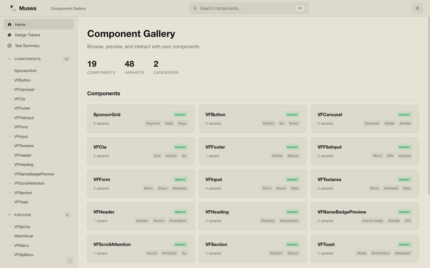
Gallery Features
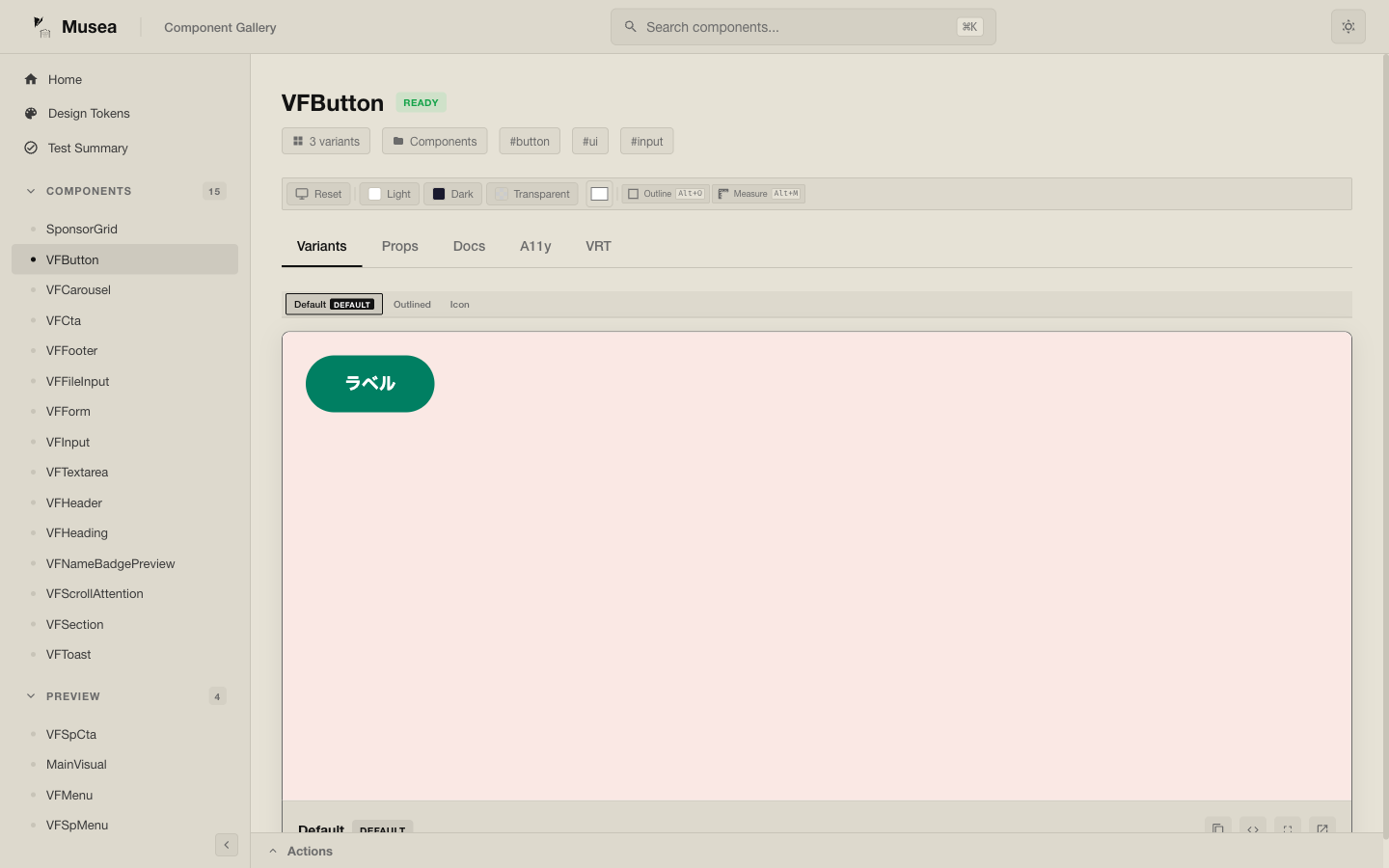
Musea can surface:
component and variant metadata
prop palette generation
design token views
accessibility checks
visual regression testing helpers
Storybook-compatible output when requested
Props Palette
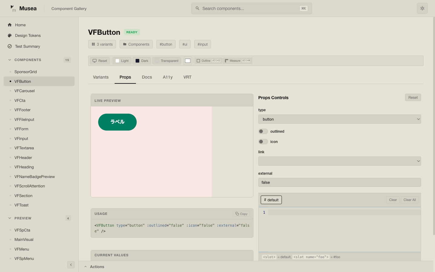
The palette pipeline can infer interactive controls from component metadata and art definitions.
Design Tokens
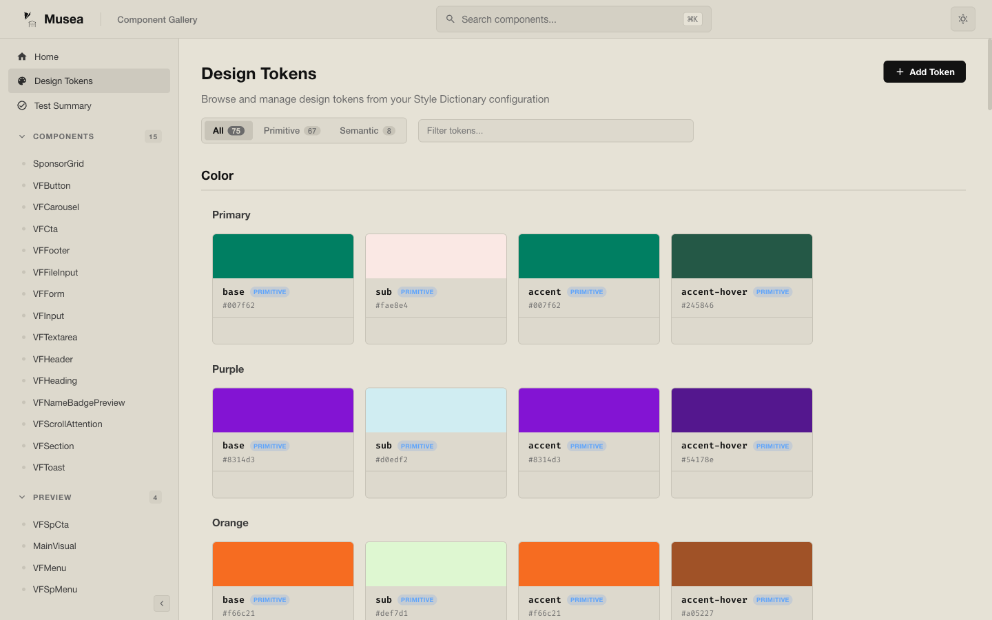
@vizejs/vite-plugin-musea can ingest a Style Dictionary-compatible token file and expose it in
the gallery UI.
musea({
  tokensPath: "src/tokens.json",
});
Preview Configuration
You can inject project CSS and preview setup code:
musea({
  previewCss: ["src/styles/main.css", "src/styles/musea-preview.css"],
  previewSetup: "musea.preview.ts",
});
This is useful for installing plugins such as vue-i18n or vue-router in the preview iframe.
// musea.preview.ts
import type { App } from "vue";
import { createI18n } from "vue-i18n";

export default function setup(app: App) {
  app.use(
    createI18n({
      legacy: false,
      locale: "en",
      messages: {
        en: {},
      },
    }),
  );
}
Visual Regression Testing
The package exposes the musea-vrt binary:
vp exec musea-vrt --base-url http://localhost:5173
vp exec musea-vrt --update
vp exec musea-vrt --ci --json
vp exec musea-vrt --a11y
vp exec musea-vrt approve
vp exec musea-vrt approve "Button/*"
vp exec musea-vrt clean
Typical CI flow starts the Vite server in one process, then runs the snapshot command against it:
vp dev --host 0.0.0.0
vp exec musea-vrt --base-url http://localhost:5173 --ci --json
The workflow: commit baselines under the snapshot directory, run musea-vrt --ci --json against a
running dev server, then inspect vrt-report.json/vrt-report.html plus snapshots/current and
snapshots/diff on failure. Re-run with --update (or approve for selected variants) for
intentional changes, and run clean after removing art files so stale baselines do not hide gaps.
--ci exits non-zero for visual diffs and for preview/capture errors (missing route, browser
failure, selector timeout); new baselines are reported as new, so run --update locally first.
The example app also wires the Playwright-native VRT path (examples/vite-musea, run via
vp run test:vrt / vp run test:vrt:update). Snapshots live in e2e/vrt/__snapshots__, failure
artifacts in e2e/vrt/test-results, and the HTML report in playwright-report; GitHub Actions
uploads them on failure so reviewers can inspect the baseline, current, and diff images.
Generate Art Files
Use the generator to create a first .art.vue draft from an existing component:
vp exec musea-vrt generate src/components/Button.vue
The generated file is a starting point. Review the variants, titles, tags, and prop coverage before committing it.
Storybook Output
Enable Storybook-compatible CSF generation when you want Musea art files to feed a Storybook setup:
musea({
  storybookCompat: true,
  storybookOutDir: ".storybook/stories",
});
CLI Status
vize musea exists in the Rust CLI, but the recommended Musea workflow today is still the Vite
plugin path. Treat the Rust subcommand as experimental while the dedicated gallery workflow settles.
The Rust subcommand can scaffold a starter art project:
vize musea new
Related Packages
@vizejs/vite-plugin-musea@vizejs/musea-mcp-servervize_musea