 Vize
use-form-field-props
Derive the default control id for a path.
| Package | @vizejs/composable/use-form-field-props |
| Own the source | vize lib pull composable:use-form-field-props |
| Runtime exports | formFieldId, toFormFieldErrors, useFormErrorSummaryFields, useFormFieldProps |
| Gzip budget | 2560 B |
Minimal setup
Use a Vue 3.5+ project with Vue SFC compilation configured (see Vite+ integration).
vp install @vizejs/composable
Import the entry directly. Call lifecycle-bound utilities inside <script setup> so cleanup follows the component scope; consult the runtime contract for this entry's SSR and hydration behavior.
import { formFieldId, toFormFieldErrors, useFormErrorSummaryFields, useFormFieldProps } from "@vizejs/composable/use-form-field-props";
Try it
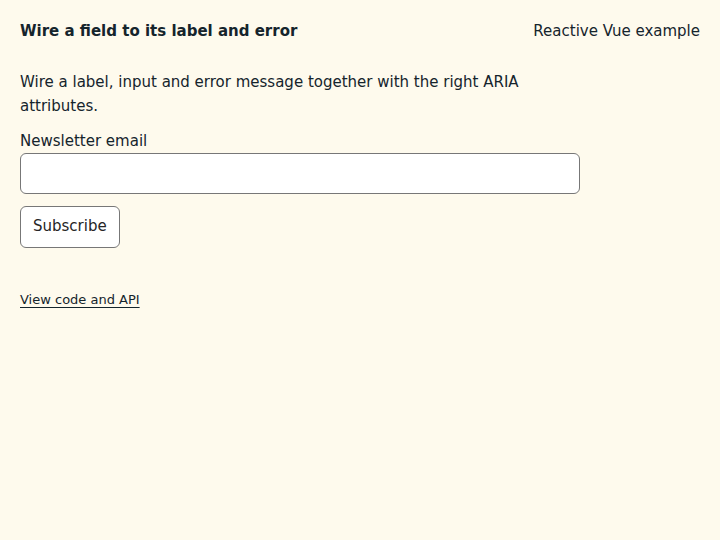
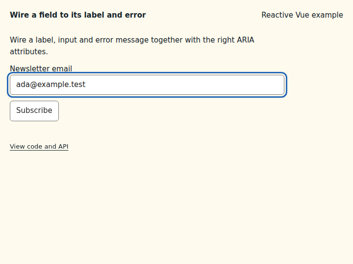
Wire a field to its label and error
Generate the ids and ARIA attributes that connect a label, input and error message.
What to observe: Subscribe with an incomplete address shows the error and marks the input invalid. A complete address clears it.
Spread labelProps, fieldProps and errorMessageProps onto the elements. Pair it with useForm, which owns values and validation.
Compare the initial and interacted states
Copy the example
Save this complete SFC in your Vue project. Its public imports and source are the same ones executed in the preview.
<script setup lang="ts">
import { useForm } from "@vizejs/composable/use-form";
import { useFormFieldProps } from "@vizejs/composable/use-form-field-props";

const form = useForm({
  initialValues: { email: "" },
  validateOn: "submit",
  revalidateOn: "change",
  validators: {
    email: (value) =>
      /^[^\s@]+@[^\s@]+$/.test(value) ? undefined : "Enter a complete email address.",
  },
});
const email = useFormFieldProps(form, "email", { idPrefix: "newsletter" });
const { value } = email.field;
const subscribe = form.handleSubmit(() => undefined);
</script>

<template>
  <form class="composable-example" novalidate @submit="subscribe">
    <p>Wire a label, input and error message together with the right ARIA attributes.</p>
    <label v-bind="email.labelProps.value">
      Newsletter email
      <input v-model="value" type="email" v-bind="email.fieldProps.value" />
    </label>
    <p v-bind="email.errorMessageProps.value">{{ email.errorMessage.value }}</p>
    <button type="submit">Subscribe</button>
  </form>
</template>
Runtime contract
| Utility | Category | Stability | SSR | Hydration | Cleanup | Targets | Host globals | Uses |
|---|---|---|---|---|---|---|---|---|
useFormFieldProps |
state | experimental | safe | stable | none | web, server, worker, native, desktop, terminal | — | useForm |
useFormErrorSummaryFields |
state | experimental | safe | stable | none | web, server, worker, native, desktop, terminal | — | useForm |
API
formFieldId
Derive the default control id for a path.
function formFieldId(path: string, idPrefix = "field"): string
useFormFieldProps
Bind one useForm field to accessible field markup and any v-model control. Returns ids, ARIA relations (fieldProps), label/description/error props, and modelProps whose shapes match @vizejs/ui's Field contracts structurally, so the bridge lives here without a runtime dependency on the UI package. Ids are derived from the path, so server and client agree without any instance-local id sequence. Server rendering: pure derived state, no host access. Cleanup: none needed beyond the owning form.
function useFormFieldProps<Values extends object, Output, Path extends FormPath<Values>>( form: FormControls<Values, Output>, path: Path, options: UseFormFieldPropsOptions = {}, ): FormFieldPropsControls<FormPathValue<Values, Path>, Path>
<script setup lang="ts">
const form = useForm({ initialValues: { address: { city: "" } } });
const city = useFormFieldProps(form, "address.city");
</script>
<template>
  <label v-bind="city.labelProps.value">City</label>
  <TextInput v-bind="city.controlProps.value" />
  <p v-if="city.invalid.value" v-bind="city.errorMessageProps.value">{{ city.errorMessage.value }}</p>
</template>
toFormFieldErrors
Convert form errors into ui FormFieldError entries ({ name, message, path }), one per message, so @vizejs/ui Field components match them by name.
function toFormFieldErrors( errors: Readonly<Record<string, readonly string[]>>, ): readonly FormFieldErrorEntry[]
useFormErrorSummaryFields
Derive @vizejs/ui ErrorSummary fields from a useForm instance. Each invalid path becomes { id, message, label? } pointing at the control id that useFormFieldProps assigns, in order then error order. Server rendering: pure derived state. Cleanup: none.
function useFormErrorSummaryFields<Values extends object, Output>( form: FormControls<Values, Output>, options: UseFormErrorSummaryFieldsOptions<Values> = {}, ): ComputedRef<readonly FormErrorSummaryItem[]>
<ErrorSummary :fields="summary" heading="Fix these fields" />
Types
FormFieldControlProps
Accessible relations for a form control. Structurally identical to FieldControlProps from @vizejs/ui/field-wiring, so the object can be bound with v-bind onto any @vizejs/ui control (or a native element) without this package depending on @vizejs/ui.
| Member | Type | Description |
|---|---|---|
id |
string |
Control id, referenced by the label's for. |
aria-labelledby |
string |
Id of the field label. |
aria-describedby |
string | undefined |
Description id and, while invalid, error id. |
aria-errormessage |
string | undefined |
Error id while invalid. |
aria-invalid |
"true" | undefined |
"true" while invalid. |
FormFieldLabelProps
Props for a <label> (or ui FieldLabel) element.
| Member | Type | Description |
|---|---|---|
id |
string |
Label id. |
for |
string |
Id of the labelled control. |
FormFieldTextProps
Props for description and error-message elements.
| Member | Type | Description |
|---|---|---|
id |
string |
Element id referenced by the control. |
FormFieldModelProps
v-model bindings for any component that follows the modelValue / update:modelValue convention, plus a blur listener that marks the field touched (and validates on blur when the form is configured to).
| Member | Type | Description |
|---|---|---|
modelValue |
Value |
Current value at the path. |
onUpdate:modelValue |
(value: Value) => void |
Writes the value at the path. |
onBlur |
() => void |
Marks the field touched. |
UseFormFieldPropsOptions
Options for useFormFieldProps.
| Member | Type | Description |
|---|---|---|
id? |
MaybeRefOrGetter<string | null | undefined> |
Explicit control id. Label, description, and error ids derive from it as <id>-label, <id>-description, and <id>-error. |
idPrefix? |
string |
Prefix of the derived id. Use a unique prefix per form on pages with several forms that share field paths. |
hasDescription? |
MaybeRefOrGetter<boolean | undefined> |
Whether a description element is rendered and joins aria-describedby. |
hasErrorMessage? |
MaybeRefOrGetter<boolean | undefined> |
Whether an error element is rendered while invalid and is referenced. |
showErrors? |
FormFieldErrorVisibility |
When errors make the field invalid: immediately, after the first submit, or once the field is touched (or the form was submitted). |
FormFieldPropsControls
Bindings returned by useFormFieldProps.
| Member | Type | Description |
|---|---|---|
field |
FormFieldControls<Value, Path> |
Underlying typed field controls. |
id |
ComputedRef<string> |
Control id. |
invalid |
ComputedRef<boolean> |
Whether errors are currently reported. |
errorMessage |
ComputedRef<string | undefined> |
First reported error, or undefined while valid or hidden. |
fieldProps |
ComputedRef<FormFieldControlProps> |
Accessible relations for the control. |
labelProps |
ComputedRef<FormFieldLabelProps> |
Props for the label element. |
descriptionProps |
ComputedRef<FormFieldTextProps> |
Props for the description element. |
errorMessageProps |
ComputedRef<FormFieldTextProps> |
Props for the error element. |
modelProps |
ComputedRef<FormFieldModelProps<Value>> |
v-model and blur bindings for the control. |
controlProps |
ComputedRef<FormFieldControlProps & FormFieldModelProps<Value>> |
fieldProps and modelProps merged, for a single v-bind. |
FormErrorSummaryItem
One invalid field, structurally identical to ErrorSummaryField from @vizejs/ui/error-summary.
| Member | Type | Description |
|---|---|---|
id |
string |
Id of the invalid control (link target). |
message |
string |
First error message. |
label? |
string |
Optional field label prefixed to the message. |
FormFieldErrorEntry
One error, structurally identical to FormFieldError from @vizejs/ui/form, so ui Field components match errors by name.
| Member | Type | Description |
|---|---|---|
name |
string |
Dotted field path, used as the ui field name. |
message |
string |
Error message. |
path |
readonly (string | number)[] |
Path segments; numeric segments are numbers. |
UseFormErrorSummaryFieldsOptions
Options for useFormErrorSummaryFields.
| Member | Type | Description |
|---|---|---|
idPrefix? |
string |
Prefix used to derive control ids; must match useFormFieldProps. |
ids? |
{ readonly [Path in FormPath<Values>]?: string } |
Explicit control ids per path, for fields bound with a custom id. |
labels? |
{ readonly [Path in FormPath<Values>]?: string } |
Human-readable labels per path. |
order? |
readonly FormPath<Values>[] |
Paths in document order; unlisted paths follow in error order. |
rootId? |
string |
Include form-level errors (the "" path) with this control id. |
showErrors? |
"always" | "submitted" |
When errors are listed: immediately, or only after the first submit. |