 Vize
Button
Headless Button; covers shadcn/ui Button, Reka UI Primitive, React Aria Button.
| Package | @vizejs/ui/button |
| Maturity | stable |
| Quality gates | behavior contract, mounted dom, type inference, tree shaking, bundle size, ssr, hydration, dom compile, ssr compile, vapor compile |
| Bundle budget | 1,000 B JS gzip / 0 B CSS gzip |
| Own the source | vize lib pull button |
| Requires | primitive, press |
| Aliases | action-button, button primitive |
| Covers | shadcn/ui Button, Reka UI Primitive, React Aria Button |
Minimal setup
Use a Vue 3.5+ project with Vue SFC compilation configured (see Vite+ integration).
vp install @vizejs/ui
Add the public import below to <script setup lang="ts">. Components provide behavior without styles; the preview uses optional Paper styles.
import { Button } from "@vizejs/ui/button";
Or copy the source into your project with vize lib pull button (see Source Distribution).
Try it
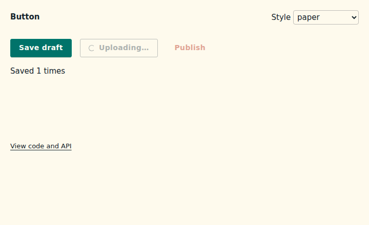
This is the basic example maintained with the component source, using the public package imports. The preview adds the optional Paper styles.
Open the interactive example · Styling these components
Copy the example
<!-- Native buttons showing press handling, a loading state, and a disabled action. -->
<script setup lang="ts">
import { ref } from "vue";

import { Button } from "@vizejs/ui/button";

const saves = ref(0);
</script>

<template>
  <div>
    <Button type="button" @press="() => (saves += 1)">Save draft</Button>
    <Button v-slot="{ loading }" type="button" variant="outline" tone="neutral" loading>
      {{ loading ? "Uploading…" : "Upload" }}
    </Button>
    <Button type="button" variant="quiet" tone="danger" disabled>Publish</Button>
    <output>Saved {{ saves }} times</output>
  </div>
</template>
Design the action before the surface
Use a native <button> whenever the action can be expressed by one. Button
keeps the platform's Enter, Space, form, focus, and disabled behavior while
adding one typed press event. Use as only when composition requires another
element or component, and set native to describe whether that target already
implements button semantics.
<script setup lang="ts">
import { Button } from "@vizejs/ui/button";
</script>

<template>
  <Button type="submit">Save profile</Button>
  <Button type="button" variant="outline" tone="neutral">Preview</Button>
  <Button type="button" variant="quiet" tone="danger">Delete</Button>
</template>
press always carries the activation MouseEvent, whether the user activates
with a pointer, Enter, or Space. That gives an application one handler without
erasing native event timing.
Model unavailable states deliberately
disabled and loading are different product states:
| State | Focus | Activation | Accessible signal |
|---|---|---|---|
| available | yes | emits once | native button semantics |
loading |
yes | suppressed | aria-busy and aria-disabled |
disabled |
no | suppressed | native disabled, or ARIA for non-native |
Keeping a loading action focusable prevents focus from disappearing while an operation is in flight. Use the typed slot state to keep its label truthful:
<Button v-slot="{ loading }" type="button" :loading="saving" @press="save">
  {{ loading ? "Saving…" : "Save changes" }}
</Button>
Choose a visual voice, then customize it
Behavior is headless. The optional stylesheet consumes only semantic data attributes and public custom properties:
import "@vizejs/ui/base.css";
import "@vizejs/ui/theme-preset-paper.css";
import "@vizejs/ui/component-button.css";
<main data-vize-theme="paper">…</main>
variant, tone, and size are closed TypeScript unions and stable styling
hooks. Presets can change geometry, typography, depth, and motion without
changing the component contract. Override the component through its public
properties instead of matching implementation structure:
.checkout-actions {
  --vize-ui-button-radius: 0.5rem;
  --vize-ui-button-shadow: none;
  --vize-ui-button-hover-lift: 0px;

  [data-vize-ui="button"] {
    letter-spacing: 0.01em;
  }
}
The shipped CSS is authored with native nesting and lowered with Lightning CSS. Consumers receive ordinary CSS and do not need Tailwind, a CSS-in-JS runtime, or the Vize build pipeline. Application CSS outside Vize's cascade layers wins normally. See UI styles for every preset and token boundary.
Accessibility is policy, not a preset
Every visual voice retains a visible :focus-visible ring, a 44 CSS-pixel
minimum target on coarse pointers, forced-colors mappings, and a
prefers-reduced-motion path. The loading indicator stops animating under
reduced motion while the textual state remains available.
An icon-only button still needs an accessible name. Provide aria-label or
visible text; the component does not guess a label from an icon.
Render it in any supported Vue host
The SFC has no browser-only setup path. The same public import is used for DOM, SSR, hydration, and Vapor compilation. Keep the Vue runtime, compiler, and server renderer on a compatible version when using Vapor; see the Vapor guide for the currently qualified pairing.
| Host | Use |
|---|---|
| Vue / Vite+ | Import the component subpath in any SFC. |
| Nuxt | Import it directly, or enable the @vizejs/nuxt UI auto-registration. See Nuxt. |
| Void | Import it in an @void/vue page; component CSS stays in Void's route CSS graph. See Void. |
For maximum ownership, vize lib pull button copies the SFC unit into the
application. The public package import and the source-distributed form share the
same behavior contract and tests.
Bundle only what the screen uses
Import from @vizejs/ui/button, not the package root, when the screen needs only
Button. Its JavaScript budget is enforced on a production consumer, and the
visual CSS is a separate opt-in asset. Importing the behavior never silently
adds a theme or another component's stylesheet.
API
Button
Source: src/components/button/button.vue
Props
| Prop | Type | Default | Description |
|---|---|---|---|
as |
PrimitiveAs |
"button" |
Native element, custom element, or component to render. |
native |
boolean |
true when |
Whether the rendered target already implements native button semantics. |
type |
"button" | "reset" | "submit" |
"button" |
Native button submission behavior. |
disabled |
boolean |
false |
Remove the control from activation and sequential keyboard focus. |
loading |
boolean |
false |
Announce in-progress work and prevent repeated activation while preserving focus. |
variant |
ButtonVariant |
"solid" |
Stable styling hook for filled, bordered, or low-emphasis actions. |
tone |
ButtonTone |
"accent" |
Semantic styling hook. It never changes button behavior or accessible semantics. |
size |
ButtonSize |
"md" |
Stable sizing hook. Coarse pointers retain the accessible minimum target size. |
Events
| Event | Payload | Description |
|---|---|---|
press |
[event: MouseEvent] |
Fired when pointer or keyboard activation reaches the rendered control. Carries the resulting MouseEvent. |
Slots
| Slot | Slot props | Description |
|---|---|---|
default |
ButtonSlotProps |
Renders the button contents with current availability state. |
Exposed
| Member | Type | Description |
|---|---|---|
element |
Readonly<ShallowRef<HTMLElement | null>> |
Template ref to the rendered root element. |
focus |
— |
Behavior
Normative state × input → outcome table for src/components/button/button.vue
(@vizejs/ui/button).
Every row is proven by the named mounted-DOM test in
src/components/button/tests/behavior.test.ts; a row
without a passing test is a contract violation.
| # | State | Input | Outcome | Proven by |
|---|---|---|---|---|
| B1 | idle, native | render | role=button, accessible name from slot, type="button", data-state="idle" |
renders a native button with an accessible name |
| B2 | idle | Tab | control receives focus | joins the tab order and focuses programmatically |
| B3 | idle | exposed focus() |
control receives focus | joins the tab order and focuses programmatically |
| B4 | idle | pointer click | exactly one press carrying the MouseEvent |
pointer click fires exactly one press |
| B5 | idle, native | Enter | exactly one press (activation on keydown) |
Enter and Space each fire exactly one press on a native button |
| B6 | idle, native | Space | exactly one press (activation on keyup) |
Enter and Space each fire exactly one press on a native button |
| B7 | idle, non-native | Enter | the component itself clicks the element; exactly one press |
Enter and Space activate a non-native button through its own handlers |
| B8 | idle, non-native | Space | keydown canceled (no page scroll); one press on keyup |
Enter and Space activate a non-native button through its own handlers |
| B9 | idle, non-native | Escape | ignored: not canceled, no press |
Enter and Space activate a non-native button through its own handlers |
| B10 | idle | click, Enter, Space | three press emits in dispatch order, each indistinguishably a MouseEvent |
keyboard and pointer presses are indistinguishable MouseEvents in order |
| B11 | disabled, native | render | native disabled attribute, no aria-disabled mirror, data-state="disabled" |
disabled native button removes activation and keeps native semantics |
| B12 | disabled, native | click / Enter / Space | no press |
disabled native button removes activation and keeps native semantics |
| B13 | disabled, native | Tab | skipped by the tab order | disabled native button removes activation and keeps native semantics |
| B14 | disabled, non-native | render | tabindex="-1", aria-disabled="true" |
disabled non-native button leaves the tab order and announces aria-disabled |
| B15 | disabled, non-native | click / Enter / Space / Tab | no press; skipped by the tab order |
disabled non-native button leaves the tab order and announces aria-disabled |
| B16 | loading | render | aria-busy="true", aria-disabled="true", data-state="loading", focusable |
loading button announces busy, stays focusable, and suppresses press |
| B17 | loading | focus() |
focus is accepted and retained | loading button announces busy, stays focusable, and suppresses press |
| B18 | loading | click / Enter / Space | no press |
loading button announces busy, stays focusable, and suppresses press |
| B19 | any | default slot render | slot receives live disabled, loading, unavailable state |
exposes live availability to the default slot |
| B20 | any | render visual hooks | literal variant, tone, and size values publish as data attributes without changing native semantics |
publishes typed visual hooks without changing native semantics |
Keyboard activation timing (Enter on keydown, Space on keyup, Space keydown
canceled) is additionally pinned as pure logic by matches native keyboard activation timing.