Explore components
Build forms, navigation, dialogs, and feedback with @vizejs/ui. Copy real examples, try live previews, and inspect each component's API.
Start with the ownership boundary
Behavior, visuals, and source ownership are independent. Start with only the layer you need; the public contract lets you move between them later.
Use the Nuxt integration or Void integration around the same public component and CSS exports.
Choose what you want to build
Open a component for a copyable Vue example with public imports, an interactive preview, and its props, events, and slots.
Add your first component
vp install @vizejs/ui
Add this SFC to a project with Vue compilation configured through the Vite+ integration.
<script setup lang="ts">
import { ref } from "vue";
import { Button } from "@vizejs/ui/button";
const saved = ref(false);
</script>

<template>
  <Button type="button" @press="saved = true">Save changes</Button>
  <output>{{ saved ? "Saved" : "Ready" }}</output>
</template>
The component behavior works without styles. These previews add the optional Paper styles; see styles and theme switching to use the same appearance.
See the components in use
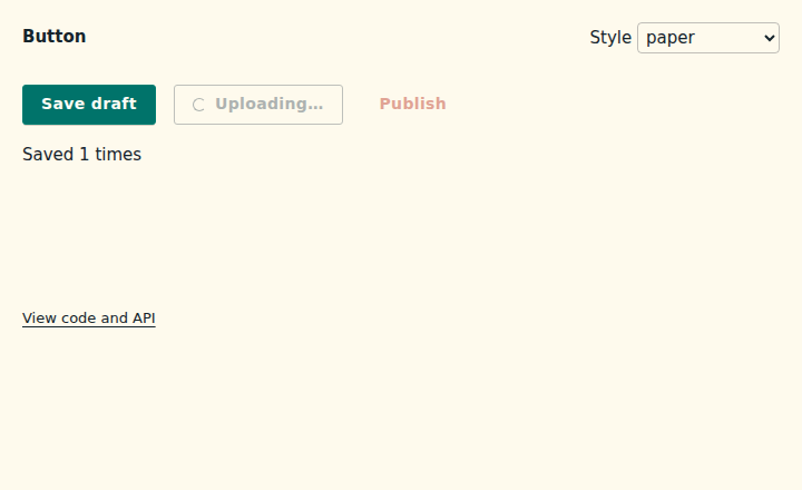
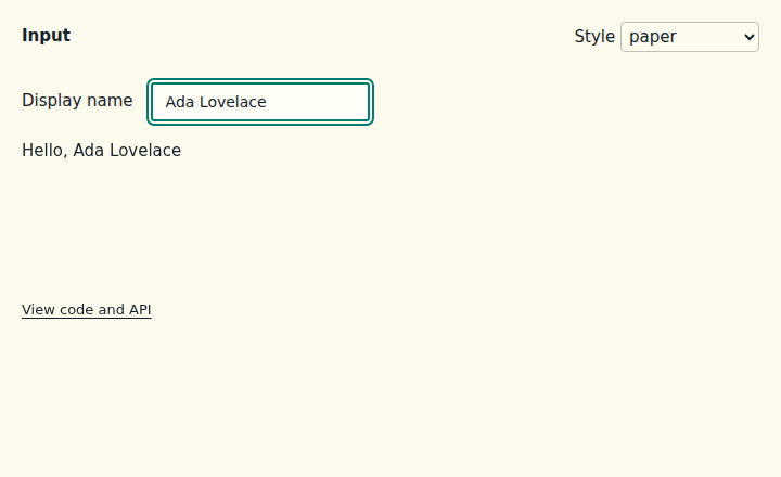
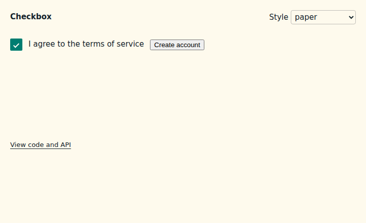
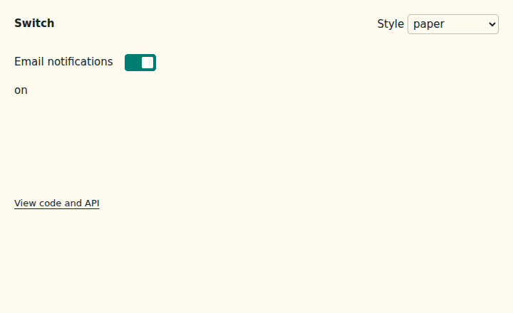
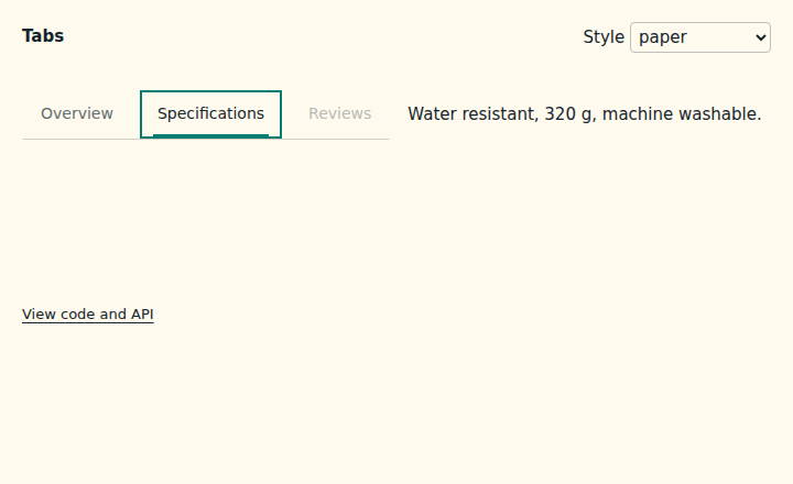
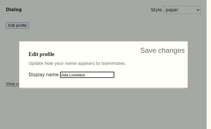
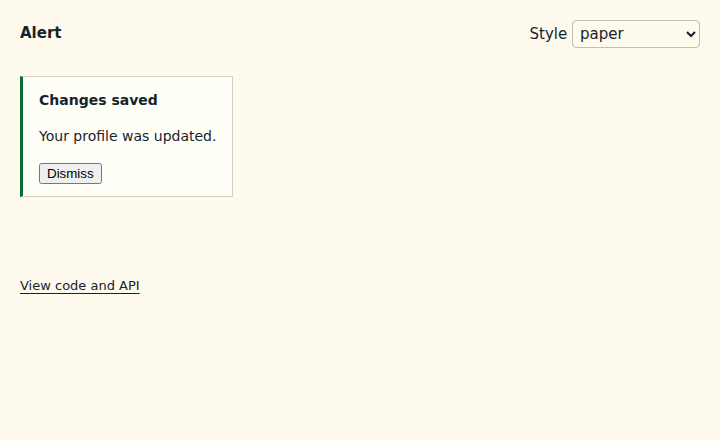
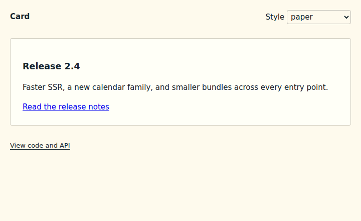
These screenshots come from the real Vue examples rendered in a browser. Open one to try typing, toggling state, or opening a dialog.
Explore your own components
Musea turns your *.art.vue examples into a component gallery. Use composables to compose behavior, or Source Distribution to own a component's source.
All component APIs
The complete source-generated reference follows, grouped by use case. Maturity describes each family's current support tier.
Support accessible interactions
| Family |
Maturity |
Summary |
| Accessibility Audit |
stable |
Development-only accessibility auditor for rendered @vizejs/ui parts. |
| Announcer |
stable |
Headless Announcer; covers ARIA live regions, coalesced announcement queues. |
| Focus Interactions |
stable |
Headless Focus Interactions; covers React Aria useFocus, React Aria useFocusRing, WICG focus-visible. |
| Focus Guards |
stable |
Headless Focus Guards; covers Radix FocusGuards, React Aria FocusScope sentinels. |
| Focus Scope |
stable |
Headless Focus Scope; covers React Aria FocusScope, Radix FocusScope, Ariakit FocusTrap. |
| Focus Visible |
stable |
Uniform focus-visible data attributes driven by the document interaction modality. |
| Outside Inerting |
stable |
Headless Outside Inerting; covers Radix overlay inerting, Adobe Spectrum overlay provider. |
| Interaction Modality |
stable |
Headless Interaction Modality; covers React Aria useFocusVisible, WICG focus-visible. |
| Landmark |
stable |
Native landmark regions with F6 / Shift+F6 landmark cycling. |
| Live Region |
stable |
Headless Live Region; covers ARIA live regions, WAI-ARIA status and alert. |
| Media Preferences |
stable |
SSR-safe user media preferences (motion, transparency, forced colors, contrast, color scheme). |
| Scroll Lock |
stable |
Headless Scroll Lock; covers React Aria usePreventScroll, Radix RemoveScroll. |
| Visually Hidden |
stable |
Content that is visually hidden while remaining available to assistive technology. |
Run actions
| Family |
Maturity |
Summary |
| Back To Top |
stable |
Headless back-to-top button that appears past a scroll threshold and restores focus at the top. |
| Button Group |
stable |
Accessible, unstyled adjacent action group with optional toolbar roving focus. |
| Copy Button |
stable |
Accessible, unstyled clipboard copy button primitive. |
| Floating Action Button |
stable |
Headless floating action button and speed-dial menu (WAI-ARIA menu button pattern). |
| Fullscreen Button |
stable |
Accessible, unstyled fullscreen toggle button primitive. |
| Print Button |
stable |
Accessible, unstyled print button primitive. |
| Share Button |
stable |
Accessible, unstyled Web Share button primitive. |
| Split Button |
stable |
Accessible, unstyled SplitButton: a primary action paired with a menu button (WAI-ARIA APG) that opens related actions. Items, groups, radio/checkbox items, and submenus are the shared Menu parts re-exported under SplitButton names. |
| Toolbar |
stable |
Accessible, unstyled WAI-ARIA toolbar with native actions and roving focus. |
Visualize data
| Family |
Maturity |
Summary |
| Chart |
stable |
Headless, accessible, SSR-stable chart components built on chart-scale and chart-shape. |
| Chart Scale |
stable |
Headless, dependency-free, d3-compatible scales with Intl tick formatting. |
| Chart Shape |
stable |
Headless, dependency-free, d3-compatible SVG path generators and chart layouts. |
Explore data
| Family |
Maturity |
Summary |
| Data Grid |
stable |
Accessible, unstyled DataGrid (WAI-ARIA APG grid / treegrid): typed column definitions, multi-column sorting, filtering hooks, column resize, reorder, pinning and visibility, row selection, cell navigation and editing, tree rows, and optional row virtualization. |
| Grid List |
stable |
Accessible, unstyled GridList (WAI-ARIA APG grid pattern for interactive lists): roving focus, typeahead, single/multiple selection with ranges, list or 2D grid layouts, and pointer + keyboard drag reordering. |
| Infinite Scroll |
stable |
Headless infinite scroll: sentinel-driven paging, load-more fallback, live status, and APG feed. |
| Kanban |
stable |
Accessible, unstyled Kanban board: columns of cards with roving keyboard navigation and pointer + keyboard drag and drop (built on the shared drag-and-drop foundation), WIP limits, veto hooks, and announcements. |
| Table |
stable |
Native semantic table component family for accessible tabular data composition. |
| Timeline |
stable |
Accessible, unstyled timeline built on a native ordered list with progress states. |
| Tree |
stable |
Accessible, unstyled, data-driven tree view with typed nodes, lazy loading, and virtualization. |
Pick dates and times
| Family |
Maturity |
Summary |
| Calendar |
stable |
Accessible, unstyled calendar compound primitive with a timezone-free date model. |
| Date Field |
stable |
Accessible, unstyled segmented date input whose segment order follows the locale. |
| Date Picker |
stable |
Accessible, unstyled date picker: a segmented DateField plus a popover Calendar. |
| Date Range Picker |
stable |
Accessible, unstyled date range picker: start/end DateFields plus a popover RangeCalendar. |
| Date Time Field |
stable |
Accessible, unstyled segmented date-and-time input in locale order with 12/24-hour clocks. |
| Duration Field |
stable |
Accessible, unstyled segmented duration input that reads and writes ISO 8601 durations. |
| Month Picker |
stable |
Accessible, unstyled grid of the twelve months of a year with year paging. |
| Range Calendar |
stable |
Accessible, unstyled two-click date range calendar that reuses the Calendar grid parts. |
| Scheduler |
stable |
Headless, SSR-deterministic day/week/month scheduler with a pure event layout engine. |
| Time Field |
stable |
Accessible, unstyled segmented time input with 12/24-hour clocks and hour/minute/second granularity. |
| Time Picker |
stable |
Accessible, unstyled listbox of time slots generated from min, max, and step. |
| Week Picker |
stable |
Accessible, unstyled calendar that selects whole weeks and shows ISO week numbers. |
| Year Picker |
stable |
Accessible, unstyled paged grid of years. |
Reveal details
| Family |
Maturity |
Summary |
| Accordion |
stable |
Accessible, unstyled WAI-ARIA Accordion built on the Collapsible contract. |
| Collapsible |
stable |
Accessible, unstyled disclosure primitive with controlled and uncontrolled state. |
Edit content
| Family |
Maturity |
Summary |
| Rich Text |
stable |
Headless rich-text editor: a typed document model (schema-declared node and mark types), immutable transactions and commands with undo history, input rules, sanitized HTML paste and serialization, and contenteditable parts. |
Show status and progress
| Family |
Maturity |
Summary |
| Alert |
stable |
Accessible, unstyled alert and status live-region container. |
| Badge |
stable |
Headless inline label primitive for status, count, tag, and chip composition. |
| Banner |
stable |
Accessible, unstyled page and section banner primitive. |
| BlockUI |
stable |
Headless region primitive for consumer-owned blocked, busy, and stale states. |
| Callout |
stable |
Headless structured feedback primitive for notes, status messages, and inline alerts. |
| EmptyState |
stable |
Headless empty-content primitive for no-results, offline, error, and retry states. |
| Meter |
stable |
Accessible, unstyled native Meter primitive. |
| Notification Center |
stable |
Accessible, unstyled notification feed and inbox that can record toast history. |
| Progress |
stable |
Headless Progress; covers HTML progress, WAI-ARIA progressbar, React Aria ProgressBar. |
| ProgressBar |
stable |
Headless ProgressBar; covers WAI-ARIA progressbar role, React Aria ProgressBar, HTML progress. |
| Skeleton |
stable |
Headless Skeleton; covers WAI-ARIA status role, shadcn/ui Skeleton, React Aria ProgressBar. |
| Spinner |
stable |
Accessible, unstyled status/progress indicator for pending work. |
| StatusLight |
stable |
Accessible, unstyled state indicator for presence and health UI. |
| Toast |
stable |
Headless toast queue, provider, region, and parts with typed imperative API. |
| Family |
Maturity |
Summary |
| Angle Picker |
stable |
Full-circle angle input (0–359°) with wrapping keyboard steps and pointer rotation. |
| Color Picker |
stable |
Accessible, unstyled color picker: 2D area, channel sliders, swatches, text field, and eye dropper. |
| Editable |
stable |
Inline edit: a focusable preview that swaps to an input, submitting on Enter/blur and cancelling on Escape. |
| Error Summary |
stable |
Headless Error Summary; covers WCAG 2.2 error identification, focusable validation summaries. |
| Field |
stable |
Accessible, unstyled Field compound primitive for form label, help, and error wiring. |
| Field Wiring |
stable |
Headless Field Wiring; covers React Aria useField, WAI-ARIA description relations. |
| Fieldset |
stable |
Native <fieldset> group with legend, description, and error wiring. |
| File Upload |
stable |
Accessible, headless file upload with dropzone, native picker, validation, and previews. |
| Standard Schema Forms |
stable |
Headless Standard Schema Forms; covers Standard Schema V1, TanStack Form, Formwerk. |
| Form Wizard |
stable |
Multi-step form with typed step ids, per-step validation gates, progress, and persisted drafts. |
| Input |
stable |
Accessible, unstyled native text input with controlled and uncontrolled state. |
| Input Mask |
stable |
Native text input driven by a typed pattern mask (phone numbers, dates, card numbers, codes). |
| Knob |
stable |
Rotary knob/dial: APG slider semantics with angle-mapped pointer dragging. |
| Mention |
stable |
Accessible, unstyled trigger-character mentions for textareas, inputs, and contenteditable. |
| Number Field |
stable |
Locale-aware APG spinbutton with formatting, stepping, press-and-hold triggers, and form association. |
| Password Field |
stable |
Password input with a visibility toggle, Caps Lock detection, and a pluggable strength meter. |
| Phone Field |
stable |
Phone number field with consumer-supplied country metadata, pattern formatting, and E.164 output. |
| PIN Input |
stable |
One-time-code and PIN entry split across single-character fields with paste distribution. |
| Range Slider |
stable |
Multi-thumb APG slider for value ranges with pointer dragging, keyboard, and form association. |
| Rating |
stable |
Accessible, unstyled native-radio rating control with controlled and uncontrolled state. |
| Search Field |
stable |
Headless Search Field; covers HTML search input, React Aria SearchField, Reka UI Primitive. |
| Slider |
stable |
Accessible, unstyled native range slider with controlled and uncontrolled state. |
| Tags Input |
stable |
Accessible, unstyled TagsInput with typed tags, delimiters, paste splitting, and form association. |
| Textarea |
stable |
Accessible, unstyled native textarea with controlled and uncontrolled state. |
Compose the foundations
| Family |
Maturity |
Summary |
| Collection Registry |
stable |
Headless Collection Registry; covers React Aria Collection, Ariakit Composite Store, Zag collection. |
| Command Router |
stable |
Headless Command Router; covers VS Code command registry, Ariakit Combobox commands, kbar actions. |
| Composite Navigation |
stable |
Headless Composite Navigation; covers WAI-ARIA composite widgets, Reka UI Roving Focus, Ariakit Composite. |
| Typed Component Context |
stable |
Headless Typed Component Context; covers Reka UI createContext, Radix context scope. |
| Controlled and Uncontrolled State |
stable |
Headless Controlled and Uncontrolled State; covers Radix useControllableState, React Aria controlled state. |
| Prop, Emit, and Expose Forwarding |
stable |
Headless Prop, Emit, and Expose Forwarding; covers Reka UI useForwardProps, Reka UI useEmitAsProps, Reka UI useForwardPropsEmits. |
| Deterministic ID Provider |
stable |
Headless Deterministic ID Provider; covers React Aria SSRProvider, Vue useId. |
| Typed Polymorphic Rendering |
stable |
Headless Typed Polymorphic Rendering; covers Radix Polymorphic, Ark UI polymorphic factory, Reka UI Primitive as. |
| Primitive |
stable |
Headless Primitive; covers Reka UI Primitive, Radix Slot, shadcn/ui Slot. |
| Slot and Prop Merging Utilities |
stable |
Headless Slot and Prop Merging Utilities; covers React Aria mergeProps, Vue mergeProps, Reka UI renderSlotFragments. |
| Design Tokens |
stable |
Headless Design Tokens; covers CSS cascade layers, CSS custom properties, semantic feedback tones. |
| Typed Class Variants |
stable |
Headless Typed Class Variants; covers class-variance-authority, tailwind-variants, Panda CSS recipes. |
Localize an interface
| Family |
Maturity |
Summary |
| Direction |
stable |
Writing-direction provider consumed by every direction-aware family. |
| Locale and Direction |
stable |
Headless Locale and Direction; covers HTML dir, HTML lang, Intl.Locale. |
| Family |
Maturity |
Summary |
| Drag and Drop |
stable |
Headless Drag and Drop; covers React Aria useDrag and useDrop, Pragmatic drag and drop adapters, HTML Drag and Drop DataTransfer. |
| Undo/Redo History |
stable |
Headless Undo/Redo History; covers ProseMirror history, CodeMirror history, Redux undo. |
| Hover |
stable |
Headless Hover; covers React Aria useHover, Pointer Events hover. |
| Interaction Hooks |
stable |
Headless Interaction Hooks; covers React Aria usePress, React Aria useHover, React Aria useFocusRing. |
| Long Press |
stable |
Headless Long Press; covers React Aria useLongPress. |
| Measure |
stable |
Headless Measure; covers ResizeObserver, IntersectionObserver. |
| Move |
stable |
Headless Move; covers React Aria useMove, Pointer Events capture. |
| Pointer Grace |
stable |
Headless Pointer Grace; covers safe triangle, hover intent polygon. |
| Press |
stable |
Headless Press; covers React Aria usePress, Pointer Events activation. |
| Pull to Refresh |
stable |
Pull-to-refresh scroll container with thresholds, resistance, async refresh state, and reduced-motion hooks. |
| Scroll Spy |
stable |
Headless Scroll Spy; covers Bootstrap Scrollspy, VueUse useIntersectionObserver, IntersectionObserver. |
| Shortcut |
stable |
Headless Shortcut; covers VS Code keybindings, React Aria useKeyboard, GitHub Hotkey. |
| Sortable |
stable |
Headless Sortable; covers React Aria useDraggableCollection, ARIA APG drag reordering. |
| Spatial Navigation |
stable |
Headless Spatial Navigation; covers CSS Spatial Navigation, ARIA grid navigation. |
| Swipe Actions |
stable |
Swipeable list row that reveals leading/trailing actions, with full-swipe commit and a keyboard alternative. |
| Typeahead |
stable |
Headless Typeahead; covers React Aria useTypeSelect, Ariakit composite typeahead. |
| Virtualizer |
stable |
Headless Virtualizer; covers windowed rendering, scroll anchoring, scroll restoration. |
Arrange a page
| Family |
Maturity |
Summary |
| Aspect Ratio |
stable |
Headless Aspect Ratio; covers CSS aspect-ratio, Radix UI AspectRatio, Reka UI AspectRatio. |
| Avatar |
stable |
Headless avatar primitive for consumer-owned identity, fallback, and presence styling. |
| Avatar Group |
stable |
Headless avatar stack with a bounded tile count and an accessible overflow tile. |
| Card |
stable |
Headless surface primitive for consumer-owned card, panel, and section composition. |
| Cluster |
stable |
Headless Cluster; covers CSS flexbox, CSS gap, Reka UI Primitive. |
| Container |
stable |
Headless Container; covers CSS logical properties, CSS max-inline-size, Reka UI Primitive. |
| Dashboard Grid |
stable |
Drag-and-resize dashboard widgets on a CSS grid with pure, collision-resolving layout functions. |
| Grid |
stable |
Headless Grid; covers CSS grid, CSS gap, Reka UI Primitive. |
| Icon |
stable |
Accessible, unstyled SVG icon primitive. |
| IconButton |
stable |
Accessible, unstyled icon-only button primitive. |
| List |
stable |
Headless list primitive for consumer-owned ordered and unordered list styling. |
| Masonry |
stable |
Column-balancing masonry layout with SSR-deterministic distribution and optional virtualization. |
| Master Detail |
stable |
Responsive list/detail pattern: side by side on wide viewports, one pane at a time on narrow ones. |
| Resizable |
stable |
Accessible, unstyled single-element resize wrapper with edge and corner handles. |
| Responsive Rendering |
stable |
Breakpoint-driven rendering: slot switching, show/hide, and a hydration-safe breakpoint composable. |
| Safe Area |
stable |
Region exposing env(safe-area-inset-*) as CSS variables, data attributes, and optional padding. |
| Scroll Area |
stable |
Headless Scroll Area; covers CSS overflow, CSS overscroll-behavior, CSS scrollbar-gutter. |
| Separator |
stable |
Headless Separator; covers HTML hr, WAI-ARIA Separator, Radix UI Separator. |
| Sidebar |
stable |
Accessible, unstyled collapsible application sidebar with rail and mobile-sheet modes. |
| Spacer |
stable |
Headless Spacer; covers CSS logical properties, HTML span, SVG element host. |
| Splitter |
stable |
Accessible, unstyled resizable panel groups following the WAI-ARIA window splitter pattern. |
| Stack |
stable |
Headless Stack; covers CSS flexbox, CSS logical properties, Reka UI Primitive. |
| Sticky |
stable |
Headless sticky/affix wrapper that pins with native position: sticky and reports stuck state. |
| Sticky Stack |
stable |
Stack several sticky headers/toolbars so each sticks below the previous ones. |
| Surface |
stable |
Accessible, unstyled polymorphic surface for section-like composition. |
| Window Manager |
stable |
Draggable, resizable floating windows with z-order focus, snapping, minimize/maximize, docks, and persistence. |
| Family |
Maturity |
Summary |
| Audio Player |
stable |
Headless audio player: the shared MediaPlayer controls under AudioPlayer* names plus the native <audio> part. Shared types and helpers are exported from @vizejs/ui/media-player. |
| Audio Visualizer |
stable |
Headless Web Audio visualizer: a typed analyser composable, pure bar/waveform helpers, and SFCs. |
| Carousel |
stable |
Headless WAI-ARIA carousel on native scroll snapping, with autoplay, drag, and slide picker. |
| Hotspot |
stable |
Headless image hotspots: positioned markers with popover details and SVG regions. |
| Image |
stable |
Headless image with loading states, candidate fallback chains, and deferred loading. |
| Image Compare |
stable |
Headless before/after image comparison with a WAI-ARIA slider handle. |
| Image Cropper |
stable |
Headless image cropper: aspect-locked crop box, zoom, rotation, keyboard nudging, canvas export. |
| Lightbox |
stable |
Headless gallery lightbox on the Dialog family: keyboard, swipe, thumbnails, and preloading. |
| Marquee |
stable |
Headless, reduced-motion aware marquee driven by measured CSS custom properties. |
| Media Player |
stable |
Headless media controls shared by the video and audio players. |
| Pan Zoom |
stable |
Headless pan and zoom container with pointer, pinch, wheel, and keyboard input. |
| QR Code |
stable |
Dependency-free QR Code encoder and headless SVG renderer. |
| Scrubber Preview |
stable |
Headless seek-bar preview: sprite, WebVTT, or captured video thumbnails with hover time. |
| Signature Pad |
stable |
Headless signature pad: pointer-captured, pressure-aware strokes rendered as SVG. |
| Video Player |
stable |
Headless video player: the shared MediaPlayer controls under VideoPlayer* names plus the native <video> part, fullscreen, and picture-in-picture. Shared types and helpers are exported from @vizejs/ui/media-player. |
| Webcam Capture |
stable |
Headless camera capture: preview, device switching, countdown shutter, and photos. |
| Family |
Maturity |
Summary |
| Context Menu |
stable |
Accessible, unstyled ContextMenu: opens a menu at the pointer on contextmenu, at the focused element on Shift+F10 or the ContextMenu key, and at the touch point after a long press. Items and submenus are the shared Menu parts re-exported under ContextMenu names. |
| Dropdown Menu |
stable |
Accessible, unstyled DropdownMenu: a menu button (WAI-ARIA APG) that opens a positioned menu. Items, groups, radio/checkbox items, and submenus are the shared Menu parts re-exported under DropdownMenu names. |
| Menu |
stable |
Accessible, unstyled Menu compound primitive (WAI-ARIA APG menu and menu button). Every menu surface — DropdownMenu, ContextMenu, and Menubar — shares this core: roving focus, typeahead, submenus with pointer grace, dismissal, focus return, positioning, portals, and presence. |
| Menubar |
stable |
Accessible, unstyled Menubar (WAI-ARIA APG menubar): a horizontal row of menu triggers with roving focus, typeahead, and Left/Right hand-off between open menus. Menu content, items, and submenus are the shared Menu parts re-exported under Menubar names. |
Move through content
| Family |
Maturity |
Summary |
| App Bar |
stable |
Top application bar: a header landmark that reports scroll elevation and can hide while scrolling down. |
| Bottom Navigation |
stable |
Mobile tab bar: a labelled navigation landmark whose active destination carries aria-current="page". |
| Breadcrumb |
stable |
Accessible, unstyled breadcrumb navigation primitive for route hierarchies. |
| Link |
stable |
Accessible, unstyled native anchor link with disabled and inert guards. |
| Navigation Menu |
stable |
Accessible, unstyled site navigation with hover-intent flyouts, an indicator, and a measured viewport. |
| Navigation Rail |
stable |
Side navigation rail: a labelled navigation landmark of top-level destinations whose current one carries aria-current="page", with an optional expanded state that shows labels beside the icons. |
| Pager |
stable |
Swipeable, scroll-snap pager with typed page ids and a segmented tab bar (APG tabs). |
| Pagination |
stable |
Accessible, unstyled Pagination primitive with controlled page state and SSR-stable ids. |
| Skip Link |
stable |
Accessible, headless skip-link primitive for same-document navigation. |
| Stepper |
stable |
Accessible, unstyled Stepper primitive for multi-step flows. |
| Tabs |
stable |
Accessible, unstyled tabset primitive with roving focus and SSR-stable ids. |
| Table of Contents |
stable |
Accessible, unstyled table of contents that tracks the section in view. |
other
| Family |
Maturity |
Summary |
| Button |
stable |
Headless Button; covers shadcn/ui Button, Reka UI Primitive, React Aria Button. |
Show contextual content
| Family |
Maturity |
Summary |
| Action Sheet |
stable |
Mobile action sheet: a bottom Drawer (native modal <dialog>, drag to dismiss, safe focus handling) whose actions follow the WAI-ARIA APG menu pattern. |
| Alert Dialog |
stable |
Opinionated alert-dialog compound primitive built on Dialog. |
| Command Palette |
stable |
Accessible, unstyled command palette built on the command router, Dialog, and composite navigation. |
| Confirm |
stable |
Promise-based confirmation helper rendered through the AlertDialog primitive. |
| Dialog |
stable |
Accessible, unstyled modal Dialog compound primitive. |
| Dismissable Layer |
stable |
Headless Dismissable Layer; covers Radix DismissableLayer, React Aria overlay dismissal, Reka UI DismissableLayer. |
| Drawer |
stable |
Accessible, unstyled side drawer (sheet) built on native <dialog> and the Dialog contract. |
| Hover Card |
stable |
Accessible, unstyled hover card for previewing linked content on hover or focus. |
| Motion Tokens |
stable |
Headless Motion Tokens; covers View Transitions API, CSS @starting-style, prefers-reduced-motion. |
| Popconfirm |
stable |
Inline, anchored confirmation built on Popover with async confirm handling. |
| Popover |
stable |
Accessible, unstyled Popover compound primitive. |
| Portal |
stable |
Headless Portal; covers HTML Teleport, document portal. |
| Positioner |
stable |
Headless Positioner; covers CSS absolute positioning, visual viewport, collision flipping. |
| Presence |
stable |
Headless Presence; covers CSS animations, CSS transitions, View Transitions. |
| Tooltip |
stable |
Accessible, unstyled Tooltip compound primitive. |
| Tour |
stable |
Accessible, unstyled onboarding tour with positioned step content and a target spotlight. |
| Transition |
stable |
Headless Transition; covers CSS transitions, CSS animations, computed motion duration. |
Choose values
| Family |
Maturity |
Summary |
| Autocomplete |
stable |
Address- and search-style Autocomplete: a thin Combobox preset with free text, open-on-focus, and recent history. AutocompleteInput, AutocompleteContent, AutocompleteItem, AutocompleteEmpty, and AutocompleteLoading are the Combobox parts under preset names. |
| Cascader |
stable |
Accessible, unstyled Cascader: typed multi-level option paths in adjacent listbox columns. |
| Checkbox |
stable |
Headless Checkbox; covers shadcn/ui Checkbox, Reka UI Checkbox, React Aria Checkbox. |
| Checkbox Group |
stable |
Typed multi-select group of native checkboxes with an optional tri-state select-all parent. |
| Combobox |
stable |
Accessible, unstyled Combobox: an editable APG combobox with a typed listbox popup. Popup structure is shared with Select: ComboboxContent, ComboboxItem, ComboboxGroup, ComboboxLabel, ComboboxSeparator, ComboboxViewport, ComboboxItemIndicator, ComboboxScrollButton, and ComboboxVirtualizer are the Select parts, which publish data-vize-ui="combobox-*" inside a ComboboxRoot. |
| Emoji Picker |
stable |
Accessible, unstyled, data-free emoji picker: consumers supply typed emoji data. |
| Listbox |
stable |
Accessible, unstyled Listbox with active-descendant focus and typed selection. |
| Listbox Grid |
stable |
Accessible, unstyled 2-D option grid (icon, color, and swatch pickers) with typed selection. The pure grid navigation (moveInGrid, gridMoveFromKey) stays internal to the family source so the subpath bundle keeps a single chunk order; source installs can import listbox-grid-model.ts directly. |
| Native Select |
stable |
Accessible, unstyled native select with controlled and uncontrolled selection. |
| Radio Group |
stable |
Accessible, unstyled native radio group with controlled and uncontrolled state. |
| Select |
stable |
Accessible, unstyled custom Select: a select-only combobox with a typed listbox popup. |
| Switch |
stable |
Accessible, unstyled native switch with controlled and uncontrolled state. |
| Toggle |
stable |
Accessible, unstyled toggle button with controlled and uncontrolled state. |
| Toggle Group |
stable |
Accessible, unstyled toggle button group with single or multiple selection. |
| Transfer List |
stable |
Accessible, unstyled dual-listbox transfer list with typed items, search, and bulk moves. |
Format text
| Family |
Maturity |
Summary |
| Blockquote |
stable |
Headless blockquote typography primitive for consumer-owned quotation styling. |
| Code |
stable |
Headless code typography primitive for consumer-owned inline and block code styling. |
| Heading |
stable |
Headless semantic heading primitive for consumer-owned typography systems. |
| Kbd |
stable |
Headless keyboard-input primitive for consumer-owned shortcut styling. |
| Text |
stable |
Headless inline typography primitive for consumer-owned text styling. |
 Vize
 Button
 Input
 Checkbox
 Switch
 Tabs
 Dialog
 Alert
 Card